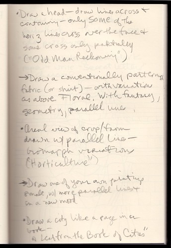
We have been reading the notebook I composed in 2002 at the Hayward Gallery in London while viewing an exhibition called: "Paul Klee: The Nature of Creation." With a practical eye and a purpose of extracting instructions for creating my own independent works of art, I attempted to describe what I saw. In this page of the notebook — the scan of which appears at the end of this post — the descriptions of Klee works appear next to bullet points and the arrows (I think!) are free-floating ideas for works of my own.
• Draw a head — draw lines across & contouring — only some of the horiz lines cross over the face & some cross only partially ("Old Man Reckoning")

→ Draw a conventionally patterned fabric (or shirt) — with variations as above. Floral. With fantasy, geometry, parallel lines.
• Aerial view of a crop/farm drawn w/ parallel lines — biomorph variations ("Horticulture")

→ Draw one of your own paintings small, w/ more parallel lines & in a new mood
• Draw a city like a page in a book — "A Leaf from the book of cities"

The scanned page:


8 comments:
Feat of Klee.
A how-to guide, not for dummies.
What if I'm Klee-curious?
Ann was an art major before she became a lawyer. My daughter was an architect and then a theater major before she became a lawyer. The law attracts some interesting people.
Klee managed the intersection of pre-post-modern music* and pre-modern art and saw that the future still required line-work to hold it all together. Also: whimsy. As George Harrison might've said, the Lines are Within You and Without You.
*Yes, I wrote "pre-post-modern". It will mean something, eventually, only to be -- inevitably -- deconstructed.
Modern art except (perhaps) Warhol: where is the importance of line? Color attracts, but lines direct.
Also:
Basquiat: lines smudge. Schnabel: plates break*.
*Schnabel turned into a heck of a director of film. One of my top-ten film moments is one of his. I will say what it was if Althouse inquires.
Modern art has no line, so it has no true sensuality. That should be its own topic. A well-drawn line is a strip-tease, not a pole-dancer. Not sure if I agree with myself here.
The well-inked line evokes calligraphy: thus, what it denotes can almost be read. Describe Klee pieces in the framework of writing: font, underscore, italics, bold. It can be done.
Thank you, Professor, for these posts.
I am always your betamax.
Do not click through to the arcana unless you are truly one of those struck with the strange desire to understand the works of Paul Klee. No one else is wanted in here.
Ha! I don't give a shit about Paul Klee, but I clicked through anyway! How's that for transgressive performance art? This comment should have its own room at MOMA!
Klee's colors are sophisticated, his lines crude.
I say Klee's method is fairly called experimental. In science, failed experiments are largely uncelebrated and underreported. Their value is utilitarian.
In the art world failed experiments are frequently venerated. Well, is this because of an abuse of language? Is it wrong to expect artistic experiments to fail? Is it wrong to think experimental failure means something like "a demonstration of the wrongness of an idea"?
Most of us are ready for the idea that art imitates science. If science were to imitate art, we should most likely judge that science had failed. To the extent that art and science appear morphologically similar owing to shared underlying conditions, we tend to view those conditions as constraints to be overcome or negotiated rather than properties intrinsic to the domains of art or science--logically, no? Mimesis is intrinsic to art; trial and error to science. If the art world takes up trial and error, it must surely be an extension of mimesis. (Multifaceted blah blah blah notwithstanding; if trial and error genuinely belonged to the ethos of art, we would see more experiments recognized as failures, and uninteresting failures at that--naturally this argument implies a limit to mimesis which the artist may wish to ignore.)
Why would you dissolve the categories? To learn something? Okay, to whom will you submit your report?
Polyphonic robot overlords, allow me to introduce Paul Klee.
I fully expect one of these tutorials to demonstrate how to get the enourmous joi de vivre of a Klee into one's own drawings.
Or at least a note that indicates one must *include* joi de vivre in one's Klee-like drawings.
I just purchased a print of this Klee Kunstwerk:
http://www.roomandboard.com/catalog/accessories/all-art/klee-orpheus
Need Althousian analysis ASAP!
Post a Comment
Please use the comments forum to respond to the post. Don't fight with each other. Be substantive... or interesting... or funny. Comments should go up immediately... unless you're commenting on a post older than 2 days. Then you have to wait for us to moderate you through. It's also possible to get shunted into spam by the machine. We try to keep an eye on that and release the miscaught good stuff. We do delete some comments, but not for viewpoint... for bad faith.