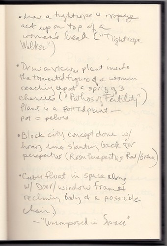
• draw a tightrope & trapeze act up on top of a woman's head ("Tightrope Walker")
• Draw a vicious plant inside the tormented figure of a woman reaching up at a sprig of 3 cherries ("Pathos of Fertility") Plant is a potted plant — pot = pelvis
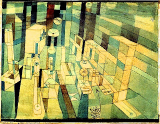
• Block city concept done w/ horiz lines slanting back for perspective ("Room Perspective Red/Green")
• Cubes float in space along w/ door/window frames & reclining body & a possible chair — "Uncomposed in Space"
The scanned notebook page:

ADDED: I like the way those 4 images, taken in that sequence, seem to tell the story of a woman. In "Tightrope Walker," we see into the woman's mind as she considers her options and seeks balance. In "Pathos of Fertility," she's opted for pregnancy, and she's struggling but focusing on the fruit (cherries) of her labor. In "Room Perspective Red/Green," she's in the home, trapped as if it's a maze. It's quite dreary, and she needs a way out. Perhaps that arrow (near the kitty cat at the bottom) points the way to the exit. In "Uncomposed in Space," the interior has broken apart, the husband lies defeated on the floor, and the woman stands erect. See her standing there, in a triangle of a skirt, on the right? I didn't notice that in 2002, I don't think. And now I see the 2 flags, in opposite corners, and the woman's flag is brighter and higher. The exit door is quite clear.
AND: There's some talk in the comments about the inaccuracy of color in reproductions, and I tempted to download the images and tweak them to make them easier to see and understand as reproductions, not worrying about approximating originals. I succumbed to the temptation with "Room Perspective," which I thought had an unfortunate dull look in reproduction:

See why I did that? But uploaded, it comes across as gaudier than it looked in iPhoto. Let me tone it down:

I think that is helpful compared to the faithful of reproduction in the original post, which reminds me of the way the whole exhibition was kept dark to preserve the colors and keep the paper from deteriorating. It's almost as if you can never really see these things, which might have something to do with my impulse at the time to translate them into text.


13 comments:
I love all the Klee.
I commented a day or two ago on the issue of reproduction of art through printing, and the inconsistencies that can occur.
When I linked to "Tightrope Walker" in yesterday's post I thought the color of the background of the linked image seemed off.
I looked through three of my Klee books as reference, and discovered that the background coloration varied in each of the books -- one of them radically so, with a higher variance of contrast along the top and bottom.
Reproduction as Tightrope Act.
Don't get me going on the inability to represent certain colors in CMYK at all. Don't.
@beta
I kind of want to download the inpmages and tweak them to make them look best as reproductions. Forget how they look as originals, but brighten the contrast so the parts I'm interested in seeing pop.
Re: "Forget how they look as originals, but brighten the contrast so the parts I'm interested in seeing pop."
Kind of like italicizing, highlighting or bolding type in a passage for emphasis.
Re: "• Cubes float in space along w/ door/window frames & reclining body & a possible chair — "Uncomposed in Space"
I notice that you did not include the flags. The flags are what I return to.
Oops. Just noticed the 'ADDED' --"And now I see the 2 flags, in opposite corners, and the woman's flag is brighter and higher."
You were reading my mind. Again.
"...the husband lies defeated on the floor, and the woman stands erect..."
Re: "It's almost as if you can never really see these things..."
Which brings us to Cubism.
Pathos heavy in symbolism?:
Three cherries: three: light, sun, fire......cherries: fertility, creativity
Flowers
___
I I
I I
I I / /
____ /
_____ /-----
O
Exit Door with Reclining Figure.
Whistler's Dog
Art lessons
Non-representational art is like Obama. You see what you want to see.
Post a Comment