🚨 NEW: Fox’s Peter Doocy just asked Jeanine Pirro if ABC’s Jonathan Karl is in trouble after President Trump called him out for ‘sticking his hand in the Reflecting Pool trying to rip the rubber off the surface.’
[E]xperts who warned that the dark blue colour would absorb more sunlight than the original light grey concrete and become a perfect environment for algae to bloom were quickly proven correct... This week workers appeared with bottles of hydrogen peroxide that they poured into the 6.75 million gallon pool. Officials said that this would work with the new ozone-injected nanobubble filtration system that was supposed to combat the growth of algae... “This is some six-and-a-half million gallons of water we’re talking about here, so that’s a lot of bottles of anything that you’d have to add,” Steve Goodale, a pool maintenance expert.... “But the hydrogen peroxide is an oxidizer itself, in the same way that the nanobubbler system is, so the two systems are essentially the same thing, just a different approach to it.”
I hope they fix it, but for now, it's at least embarrassing.
Harper's Bazaar did that round-up in 2014, and Diana Vreeland worked there from 1936 until 1962 and then at Vogue from 1962 to 1971. I got sidetracked into the topic of Diana Vreeland after blogging about the Vogue editorship passing from Anna Wintour to Chloe Malle. As I noted in the comments section to that earlier post, I had a job in the early 1970s that required me to read Vogue (among many other magazines) ever month. I was intensely aware that there had been an earlier era that was so much wilder and crazier.
But the pink bulletin board with thumbtacks seems within anyone's reach. I assume "pin with colored thumb-tacks all your various enthusiasms" means use colored thumb-tacks to pin up slips of paper upon which you've written words representing whatever you're currently feeling enthusiastic about.
"'In that studio, I met a lot of people that help me feel safe and feel able to create whatever I want without thinking: Am I going to sell this or is this going to be something that people are going to want in their stores?' said Ms. Muñoz, who now lives in El Paso and has a studio in Guadalajara, Mexico."
I'm expending one of my 10 gift links on this one because I want you to see some of the godawful pottery the NYT is promoting for artists and empowerers of people of color. I found this article at the top of the NYT home page, right next to "Trump Favors Blunt Force in Dealing With Foreign Allies and Enemies Alike." No pun intended, I'm sure.
I'm old enough to remember the kind of gigantic atrocious ashtray that was regarded as an "art piece on your coffee table," back in the heyday of tobacco smoking.
Smoking paraphernalia "joined the world of home decor" a long time ago.
By the way, did you ever look and look and finally find a place where people helped you feel safe and feel able to create whatever you want without thinking and then you relocated to Mexico?
Now, get out there and be creative. Creative for the people. Of color. Perhaps orange. Or avocado....
"In a few short days, supporters of Vice President Kamala Harris, who is seeking the Democratic presidential nomination, memed chartreuse into an unusually potent political symbol.... 'I will aspire to be Brat,' Jake Tapper said on CNN to one of his correspondents, who had been holding up a slime-green meme printed out on a sheet of paper."
I used the last of this month's NYT gift link allowance on that article. Why? Because I knew it was hard to understand without more explanation, but I didn't want to do the explanation.
And you'll need to go over there anyway to see the particular green in question. It's a color that's connected to this word "brat," which reminds me of a word from many years ago when I was a teenager: "groovy." It was new and cool and precisely expressive of youth for a very short time before it got seized upon by everyone old and it became embarrassing.
From the golden moment before the collapse of "groovy":
Once the TV talking heads and political candidates start using your word, they've stolen it from you. You have to move on or use it ironically or do whatever it is you kids do today when the adults are annoying you.
As for you political candidates, be careful using the word "brat" in Wisconsin. I remember when John Kerry screwed up.
"Basically, when you look at the sun, it has enough of all the different colors in it and it’s so bright that everybody’s eyes are firing like crazy and saying, 'It’s too bright for me to tell you what color it is.' That’s why the sun looks white to us... 'Essentially, it’s a green star that looks white because it’s too bright, and it can also appear yellow, orange or red because of how our atmosphere works.... 'The sun is at its midlife, and it still has quite a lot of years before it changes colors.... It still hasn’t dimmed out one bit.... When astronomers say color, they really mean temperature.... But to anyone in the public, color just means the color you see and how you make sense of the world."
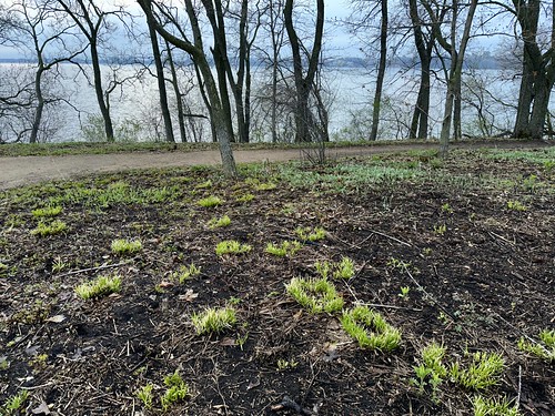
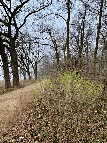
The second photo shows the scorched ground from the prescribed burn a couple weeks ago. It's interesting how some of the regrowth is coming up in circles.
I love James Taylor and the referenced song, and I'm not saying the whole humor piece is great, but it's there and it might amuse you if your quirky sense of humor aligns. I'm blogging it because I can imagine feeling so bonded to James Taylor that deep greens and blues would be the colors you choose, and because I've been thinking about the trend these days to drain color out of everything. Here's a TikTok I ran into yesterday, from Interstellar Isabellar, complaining about chromophobia in interior design:
ADDED: My theory is that they adjusted the color until Arabella was dressed in the shade of blue associated with Tiffany & Co. — see it here — and the other clothing (and the sky) went along for the ride. It came out so cute and hilarious that they put it up on Instagram, and the haters made it viral.
BUT: I looked through her Instagram but didn't see the picture. Others dug all the way back to last year — I didn't go that far — and found it:
"... carpets the floors of the State Capitol 'in a pleasing shade of green,' Didion writes. (What green carpet, Didion’s deadpan delivery invites us to ask, has ever been 'pleasing'?) Didion’s understated tone registers the nuances obscured by the quotidian: the stiff neutrality between mother and son ('The Skipper’s arrival is, I have been told, the pivotal point of Nancy Reagan’s day'), Nancy’s preference for little choreographies... As [Didion] puts it in her 1976 essay 'Why I Write': 'I write entirely to find out what I’m thinking, what I’m looking at, what I see and what it means. … What is going on in these pictures in my mind?'"
[Purple] wasn't the only color to avoid. Scarlet could push you into a murderous rage, while blue “excites the imagination and gives a craving for music and stagecraft, but it has a reaction that wrecks the nerves.” Meanwhile, “Solitary confinement in a yellow cell … will weaken any system and produce chronic hysteria,” and “sheer dead white, unbroken, will destroy your eyesight.”
Sounds like the key is to vary your colors. What drives you mad is the monotone. Do we really know the effect of one-intense-color interiors on people who stay inside all the time?
This question makes me think of Monet's all-yellow (almost) dining room at Giverny:
Elizabeth Warren sets off the fairly traditional dark blue and red in her palette with an unexpected mint green to freshen things up. The overall impression gives off a fitting academic activist vibe.
Kamala Harris’s branding features a blueish purple, a desaturated red, and a joyful, buttery yellow. The choice of yellow is an homage to Shirley Chisholm’s historic candidacy launched 47 years to the day before her own candidacy. Harris is half Jamaican and half Indian, and the palette of her branding comes across as an authentic celebration of both her identity and America’s multiracial and multicultural society.
Mint green? Joyful, buttery yellow?? That made me laugh. These colors are not fresh-looking at all. They look like they came from the 70s.
And think about doing a little shopping at Amazon through The Althouse Portal.
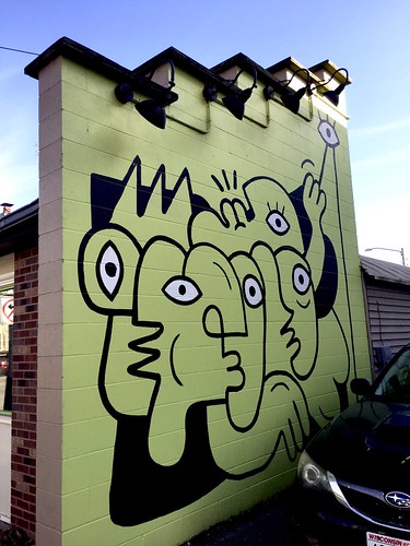
I love the mural, by the way. Such a weird wall to begin with, then a striking, simple design. The style reminds me of one of my favorite artists, Victor Brauner.
I am a participant in the Amazon Services LLC Associates Program, an affiliate advertising program designed to provide a means for me to earn fees by linking to Amazon.com and affiliated sites.
Encourage Althouse by making a donation:
Make a 1-time donation or set up a monthly donation of any amount you choose:










 पोस्ट्स


