લેબલ Magritte સાથે પોસ્ટ્સ બતાવી રહ્યું છે. બધી પોસ્ટ્સ બતાવો

13 એપ્રિલ, 2025

Eric Lee's photograph of Gretchen Whitmer in the Oval Office is a sublime work of art.

 
From the golden eagle under the table in the lower left to George Washington's camel-toe pants to the 3 shades of blue in the too-tight clothing of the 3 human figures to the insane line-up of gold objects on the mantle to the now-iconic desperate gesture of hiding behind binders, the photograph is perfect.

Link to NYT page: here.

You're either there or you're not. You can't concoct a way to not be there when you are there. It's like the way a baby might think in the early stages of learning the game of peek-a-boo. It's reminiscent of thousands of photos of perps — walked in front of the press — trying to hide behind their collar.

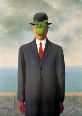
It made me think of Magritte....

20 જૂન, 2018

The Tuesday NYT crossword puzzle had a "trigger warning" theme with answers — like "bazooka bubblegum" — that began with guns, and the regular crossword-puzzle columnist at the NYT refused to blog it!

The crossword editor, Will Shortz, took over:
There was a behind-the-scenes discussion regarding Peter Gordon’s crossword, which is why I’m writing about it rather than Deb Amlen, the Wordplay editor.

She was so disenchanted with the puzzle’s gun theme — especially in this era of widespread violence — that she didn’t feel she could give it a fair write-up. [This is true. I believe that this puzzle will be upsetting to some people because of its timing, subject matter and revealer, and did not think I could be respectful or kind to it. So I thought that it would be better for you to hear from Will today. — D.A.]

I respect that, so I am writing today’s column, instead.

I liked the puzzle because of the freshness and simplicity of the idea and the elegance in the way it was done.... The revealer of TRIGGER / WARNING (26D/25D) — using this modern phrase in an unexpected way — was icing on the cake.

I added the photo for metaphorical zing. Back to Shortz (somebody stop me from saying "men in shorts"):
The puzzle’s subject of guns didn’t bother me. For better or worse, guns are part of American life. I have my own opinion about guns and their regulation, but as a general matter I try to keep my political views out of the puzzle.
Lots of things are part of American life but kept out of the NYT crossword because they're thought to be inconsistent with the escapist fun of doing the puzzle at breakfasttime. For example, defecation — also part of American life — is excluded.

I don't normally read the NYT puzzle column, though I always do the NYT crossword and I usually read Rex Parker's blog about it. It's via Rex that I ended up looking at Shortz, and the guns bothered Rex too (and before he saw Deb Amlen's resistance:
[G]uns, violence, yuck. This is a personal thing, but I don't really want to participate in crossword gunfests. Guns don't "tickle" me, I guess. Too much daily slaughter in this country for me to be able to enjoy cutesy gun-related wordplay.... But if I just pretend there's no theme, I actually like this grid pretty well, except for WANGLE, which is about the most off-putting word in the English language (67A: Accomplish schemingly). I really wanted WRANGLE there, as it's a good word, as opposed to WANGLE, which is like WIGGLE and DANGLE got together pretended to be a phallus. I mean, come on. It's got WANG right in the name.
An interesting train of thought, but the guns/phallus association is so common it's trite, except to the extent that it's funny, it's some serious analysis of the human tendency toward violence, or it's revelatory of why some people feel instinctive disgust about guns.

The Shortz column has an update:
The original photo on this column, which showed a man firing an automatic rifle at a firing range, was my choice, not Will’s. It was a misguided attempt to demonstrate that words are not just words, and pictures are not just pictures. I apologize for it, and have replaced the photo.
The replacement photograph is of an old man at a lectern, with the caption "English-Canadian musicologist Dr. Alan Walker lecturing on the music of Franz Liszt at the Mannes College of Music." That must seem to fit because the title of the column — and the clue for the answer "trigger warning" — is "Caution Before a Potentially Upsetting Lecture."

A misguided attempt to demonstrate that words are not just words, and pictures are not just pictures... I'm really not sure what that means. The explanation is itself misguided. What was Shortz Amlen attempting to do? Why would a picture of a gun demonstrate that a picture of a gun is not just a picture of a gun and that a word is not just a word? All I can think is — and thanks to the person* who made this image (which I was hoping would exist):
__________________

* The poster — based on the famous Magritte painting "The Treachery of Images" — seems to be by Dave Kinsey. I think you can buy it here.

29 જાન્યુઆરી, 2017

Magritte painting long known only from a black-and-white photograph has been found... but you'll never get to see it.

"The Enchanted Pose, which showed two almost identical female nudes side by side in a neoclassical style, was exhibited in 1927 but disappeared."

Magritte cut it in 4 pieces and reused the canvas, not painting on the reverse side, but on top of the painted image, which I assume he didn't like. (It's not that good.)

The first 2 pieces were discovered in 2013, under "The Portrait" in the Museum of Modern Art and under "The Red Model" in the Moderna Museet in Stockholm.

Now, a third piece has been found, under "The Human Condition" at the Hamilton Kerr Institute at the University of Cambridge, whose historic art curator Dr. Giorgia Bottinelli say:
"If it was technically possible [to extract the hidden painting] it would certainly be unethical, as it was Magritte himself that decided to cut up one of his paintings and then create new compositions over the fragments.... The preservation of the artist's intention is in my opinion our main priority. Non-invasive and non-destructive imaging techniques will enable us to make a reconstructed image of the hidden painting."
Certainly unethical?! I find that hard to believe. Does a principle of the "artist's intention" require us to look away from artwork he didn't choose to preserve for display? If so, why are we looking at the black-and-white photograph of it? How do we know he preferred "The Human Condition" (just because he hadn't cut it up or painted over it yet)? If we found a stash of Magritte's preparatory sketches in a portfolio labeled "Do not display. These sketches are to be burned" would we follow his instructions?

What should we do with a portfolio labeled "Do not display. These sketches are to be burned"?
 
pollcode.com free polls

14 જાન્યુઆરી, 2017

"A 1989 photograph of Donald Trump tossing a red apple was installed today at the Smithsonian's National Portrait Gallery in Washington, D.C."

"This photograph has led many lives, nearly disappearing into obscurity. In 1989, Trump posed for [Michael] O'Brien, who was on assignment for a Fortune magazine story on American billionaires. From the beginning, O'Brien knew he wanted to place Trump against a backdrop of a bright blue sky and cotton ball clouds, a sky he says was inspired by the surrealist painter Rene Magritte. The apple was a last-minute addition, he told NPR. 'On the day of the shoot I thought, "It needs some type of action, something unexpected but telling." Bingo! A big red apple popped into my head ... It was sort of subconscious the apple. It was sparked by a color scheme, and I later realized it was symbolic of New York.'... [A]bout a year later, Random House asked O'Brien for the rights to use the image for the cover of Trump's autobiography Trump: Surviving at the Top. Over 20 years after that, the image was acquired by the museum. Today the portrait hangs under wall text that reads ' 2017 Inauguration, Donald J. Trump.'" Reports NPR.


Nice picture. Especially because the apple represents the geographic place Trump dominated, it makes me think of Chaplin tossing the globe around in "The Great Dictator":


But O'Brien says he was inspired by Magritte:


That's the one with the apple, but the sky is not bright blue with cotton-ball clouds. That seems to point to this famous Magritte image:


Perhaps O'Brien conflated the images. Question which of the 2 relates more to Trump. Trump doesn't seem to get obscured by things in front of his face, so I think the second image is more relevant. The surrealism is the nighttime on the ground while it is daylight in the sky. These are dark days, it seems, to many of us as we short-sightedly observe our immediate surroundings. But perhaps it is Morning in America, and those with their head hung down cannot see it.

6 ફેબ્રુઆરી, 2012

At the Wine Bottle Café...


... you get the message.

14 જાન્યુઆરી, 2011

21 મે, 2010

Nick Gillespie gets soooo intellectual about the basis for judging Reason Magazine's "Everybody Draw Mohammed" contest...

... that I was forced to look up his educational background. Turns out he has a PhD in English literature. Ah, it makes too much sense to me.

Now, they got 190 entries in the contest. (I disapprove of the "Draw Mohammed" day, you should know.) I would love to see what the whole pile of drawings looked like. How many were stick figures or crude scratchings on the level of the "Draw Me" pirate? How many were loaded with embarrassingly violent or racial fantasy? I wish someone had had the foresight to film a documentary of these Reason guys cooking up their contest and then opening the various envelopes? I wonder if there was a point — one particular drawing? — when they felt bad about what they were doing.  And then something pushed them in the direction of getting super-elitist intellectual about picking the winners.
In coming to a consensus, we discussed standard concerns such as originality of vision, playfulness, a sense of proportion (both in terms of craftmanship and message), and relevance to the goals of the contest.
See? Read between the lines! What were they looking at when they reached that consensus? How many pieces of paper went into the discard pile over "craftsmanship"? How much did they laugh as they did a first cut over craftsmanship, and what did they say as they tossed these things aside? I would love to have been a fly on the wall... or a vole in the corner. "Sense of proportion"... what were the drawings that made them frame that standard? "Originality"? What percent of the artists drew Muhammad as a dog or as a guy with a turban-bomb? "Playfulness"... throw all the gruesome, gory things over there. "Relevance to the goals of the contest"... ha ha... so many of you scribblers did not get it. You thought it was about telling Muslims their prophet is evil, and not that free expression is precious. You fools! Did you think Nick Gillespie went to grad school for this?! 

Okay, I'm picturing approximately 90% of the drawings eliminated over these standards.

So Gillespie reveals the true test of a proper "Draw Mohammed" drawing.
The single most important element...
It's one thing.
.... and the thing that ties these selections together–is that each image forces the viewer to do two things.
I mean... it's 2 things!
First, they consciously call into question the nature of representation, no small matter in fights over whether it is allowed under Islamic law to depict Mohammed (for the historical record, there is no question that the idea that is always wrong is only of recent vintage; there is a long history of sacred and superficial images of the Prophet). The homage to Rene Magritte below states "This is not a pipe. This is Muhammed"...
He's translating the French for us. (And respelling "Muhammad" as "Muhammed," splitting the difference between the contest-name spelling — "Mohammed"— and the artist's use of the presumably politically correct spelling — "Muhammad.")
... playing with the surrealist's famous statement about the necessary disjuncture between a picture and the thing it seeks to represent. 
An insight that somehow fascinated people who studied post-modernism circa 1990. (Gillespie received his English PhD in 1996. I'd love to know more about what he studied. Can we see his dissertation?)
Just as the drawing is not a pipe (it's a drawing of a pipe), it cannot be Mohammed even as it insists it is. Even more, it is plainly not even a drawing of Mohammed or of any human figure.

Similarly, the invocation of the popular Where's Waldo? series forces the viewer to ask Where's Mohammed?, and to begin a hunt for a figure in the midst of an overstuffed scene. One assumes the black-robed character in the upper right-hand quadrant of the image is our quarry, but then what does it mean to confer on a small dot any significance whatsoever?

Second, each of the images forces the viewer to actively participate not simply in the creation of meaning but of actually constructing the image itself. This is clearest in our grand prize winner, the image below, which pushes iman and infidel alike to do the work that would condemn them to death under the most extreme reading of injunctions against representing Mohammed.
I like the way the winner — with a connect-the-dots puzzle — avoided drawing Muhammad altogether. Man, if I entered a "draw Mohammed" contest and the winner didn't even draw Mohammed, I'd be kind of pissed... and reading Gillespie's revelation of the highly intellectual but previously secret standards would not calm me down. "Reason"?! Bah!

21 જાન્યુઆરી, 2010

At the Forbidden Reflection Café...


... will you ever know who you really are?

ADDED: Thanks to Instapundit for linking to this — and, as you'll see if you clink on the "will you ever know" link — to Pogo for making the connection to Magritte and to Henry (the commenter) for the photoshopping.

7 ઑક્ટોબર, 2004

Things Mimi wouldn't understand.

Yoko Ono (in today's NYT) explains why John Lennon's early drawings were surrealistic, but his later ones realistically depicted domestic life:
"In the beginning, when he was doing the exaggerated stuff - the monster-looking people, and all that - those come from a time when he felt that Mimi was always looking over his shoulder," she said, referring to Mimi Smith, Lennon's aunt, who raised him. "He said that was how he came to surrealism. He would write things in his diary that he wouldn't want Mimi to understand, and the drawings were an extension of that. He was getting into an unreal, illusory world.

"Then when he met me, he felt that reality wasn't that scary anymore, so he began drawing us. And eventually, because he was learning Japanese, his drawings were a reflection of that experience too, but the more prominent change was that he began doing a lot of animals, and that was for Sean."
Oh, I think there is a lot more to surrealism than hiding from Aunt Mimi. Ono also says that in the early days of their relationship, talking about art, Lennon said "I think of myself as Magritte." The fact is, the early surrealistic line drawings are much more interesting. If his surrealism was about hiding from the female authority figure of his early life (Mimi), why should we not view the later realistic domestic scenes as mollifying the female authority figure of his later life (Ono)?

The Times article relates to the "When I'm Sixty-Four" gallery show, the title of which I complained about at some length here. There's a slide show of Lennon's drawings at the first link above.

UPDATE: Here's a link for Magritte, whose work really isn't very much like Lennon's surrealist line drawings. Lennon's work is far more similar to Jean Cocteau's drawings.