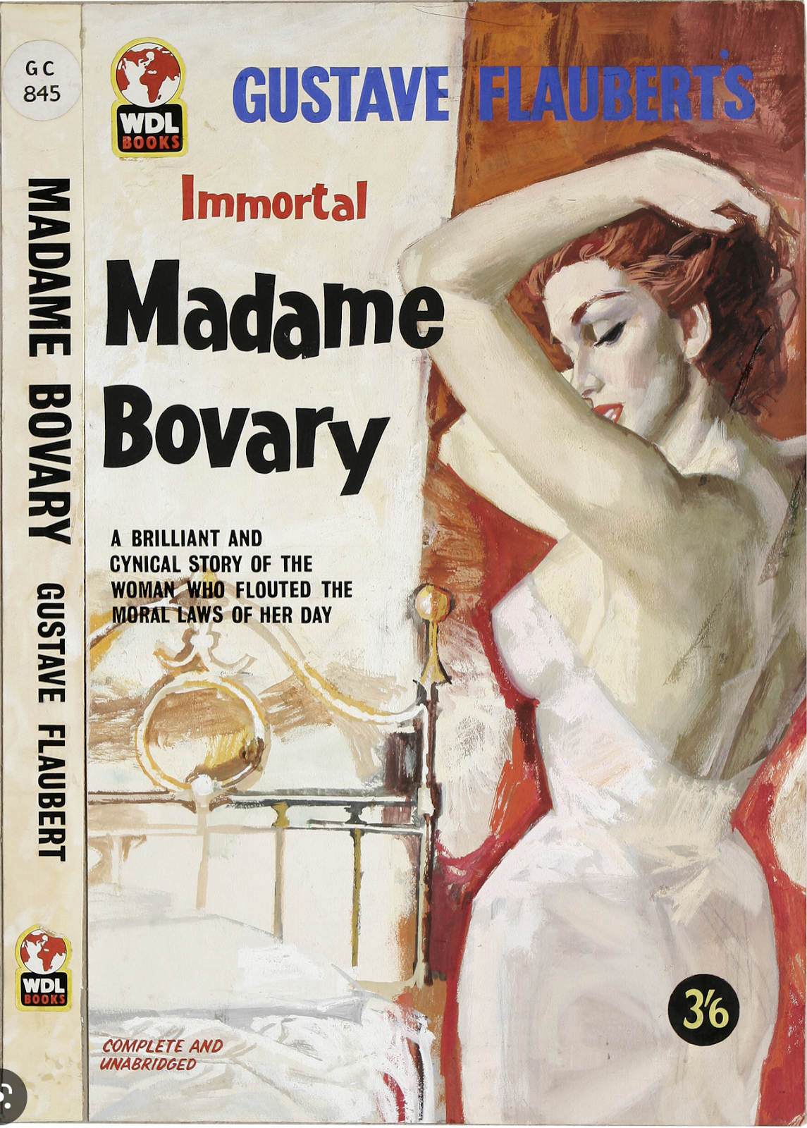
"... histories of rock and roll treat what accompanied it on the airwaves of the fifties as if the music were all 'Sing Along with Mitch' and 'How Much Is That Doggie in the Window?,' when it was also Sinatra’s concept albums, Sarah Vaughan’s collaborations with George Treadwell, and Dave Brubeck’s million-selling recording of a jazz instrumental in five-four time. And so we remember paperback books, pre-Push Pin, as either clinically bare, as with Modern Library editions, or outlandishly lurid, as with an edition of 'Madame Bovary' featuring an Ava Gardner-style femme fatale, complete with slipping negligee....There was, in truth, much ambitious 'art' illustration in those years, including Ben Shahn’s covers for S. J. Perelman and Kauffer’s cover for Ralph Ellison’s 'Invisible Man.'"
Here are those Ben Shahn covers.
Here's that Kauffer cover.
And I think this might be the referenced "outlandishly lurid" "Madame Bovary" cover:
Or... this fits the description better (but it's a British edition):


22 comments:
So they are saying that you can judge a book by its cover?
I blame President Emeritus Trump. I don't know what he did or how he did it, but it is his fault anyway.
John Henry
Had it been entitled 'Madame Ovary' it would have been cancelled by now as transphobic.
Can't say I give a poop. So I'm off to pluck the evil flowers coloring my lawn.
P.S. I'm trying to pin down the gayest bird imaginable for the title of my satirical hard-boiled detective story about our incomparable Secretary of Transportation. Any hints?
i'd pay 3 and 6, for that last book! Or, i Would; if i knew what 3 and 6 meant*
what 3 and 6 meant * 42 pence**
42 pence** about a third of a pound sterling***
a third of a pound sterling*** about a pre 1964 dollar****
pre 1964 dollar**** now i Am stuck.. a 35th of an ounce of gold?
Blue Note album covers, too. That was the thing to me in 1968.
Do an image search on "blue note album cover" and you'll see what I mean. It reflects the same 50's aesthetic that walks right into the cover of Meet The Beatles. After a certain point of the 60's that was gone for good, and I always missed it. After that point, it was nostalgia.
Think how the Dylan album covers evolved through from the debut album forward. Times They Are A-Changin could easily be a Blue Note cover.
That British cover of "Bovary" reminds me of my childhood edition of "Jane Eyre". It was a paperback that fell apart as I read it with that same painting style. Not lurid, just gothic. I would rubberband the book together rather than buy a new edition because the cover was so evocative.
That Madame Bovary cover reminds me of Kilgore Trout, Kurt Vonnegut's fictional science fiction author, whose stories were bought by porn publishers purely as textual filler, and published in books blazoned "Wide Open Beavers Inside!"
My favorite was a cover for Vanity Fair, and a sultry half-dressed Becky Sharp.
Not, that I actually care, but can someone explain, what this guy, just said, in that tortured, sentence?
Anyone who purchased Madame Bovary because of those enticing covers would have been sorely disappointed by the actual novel.
You've reminded me of my favorite Invisible Man joke.
Nurse: "I have good news, the doctor can see you now."
And in truth, the Golden Age of Science Fiction was the '60s and '70s. It was when the acknowledged masters such as Heinlein, Asimov, Bradbury, Clarke, and the dozens of others who were almost as good, were being published in paperbacks, with lurid covers, and some of the best specfic ever written hidden inside. I grew up on that stuff, and had no idea how lucky I was. But I had to buy those little opaque plastic paperback covers for them, otherwise I ended up in the principal's office explaining that no, they were not porn, that was just how they did scifi covers. Thank goodness we had a librarian who took the time to talk to the principal and keep me out of hot water!
The Bovary covers are schlocky...the others are very good.
Speaking as a professional...
I was surprised to see how many covers of books that I have owned were designed by Ben Shahn, who I thought only did grim etchings of Sacco and Vanzetti.
I also wondered what was going on on that cover of The Road to Miltown, before I realized it was flowers in the figure's hand and not a misplaced bush.
And why all the upstretched hands to illustrate The American Experience? Maybe our pondering the possible connections was the point of the illustration.
In his book covers, Shahn seems to have specialized in vaguely tormented and "existentialist" motifs and styles, an evolution from his earlier tormented socialist realist work.
Real skill is needed for good graphic design and it's much better than most contemporary art and all conceptual art.
Those book covers definitely convey a particular era. I look at them and think late 50s - early 60s.
Queastor
Peacock
Golden pheasant
I imagine you want something flamboyantly colorful.
Madame B is about as wank-worthy as Lolita, which is to say, not at all.
The Penguin Classic pbk cover of Lolita is totes Fifties.
feminine mystique
"I'm trying to pin down the gayest bird imaginable"
That would be the Blue Jay. Loud, colorful, and full of spite.
I missed this yesterday, and I have nothing to say but that I have always loved Glaser's work. He really was a giant in his field.
Another favorite contemporary graphic designer of mine whose work is striking (and who also draws from pop culture) is Art Chantry.
The Museum of Modern Art had an exhibition of his work at their annex out in Queens years ago. I was unfamiliar with him at the time and I did not, sadly, see the show.
"We tend to overstate the poverty of the style that precedes a style we admire..."
"... histories of rock and roll treat what accompanied it on the airwaves of the fifties as if the music were all 'Sing Along with Mitch' and 'How Much Is That Doggie in the Window?,' when it was also Sinatra’s concept albums, Sarah Vaughan’s collaborations with George Treadwell, and Dave Brubeck’s million-selling recording of a jazz instrumental in five-four time. And so we remember paperback books, pre-Push Pin, as either clinically bare, as with Modern Library editions, or outlandishly lurid, as with an edition of 'Madame Bovary' featuring an Ava Gardner-style femme fatale, complete with slipping negligee....There was, in truth, much ambitious 'art' illustration in those years, including Ben Shahn’s covers for S. J. Perelman and Kauffer’s cover for Ralph Ellison’s 'Invisible Man.'"
"Not, that I actually care, but can someone explain, what this guy, just said, in that tortured, sentence?"
He is saying that when we look back at the cultural artifacts and movements of earlier eras--rock music, graphic design, fine art, etc.--we tend to see too sharp distinctions between "before" and "after." Before the cultural earthquake of rock and roll, we see lightweight or schlocky and cornball pop music of little merit. Before the startling graphic revolutions ushered in by, for example in this case, iconic graphic designers such as Milton Glaser, we see "only" cheaply lurid illustrations or design of the most rote and mundane level, anodyne hackwork. But, as he goes on to say, this is a distortion of looking back, and that even during eras remembered as artistically moribund, striking and still memorable work was being created all the time.
Post a Comment